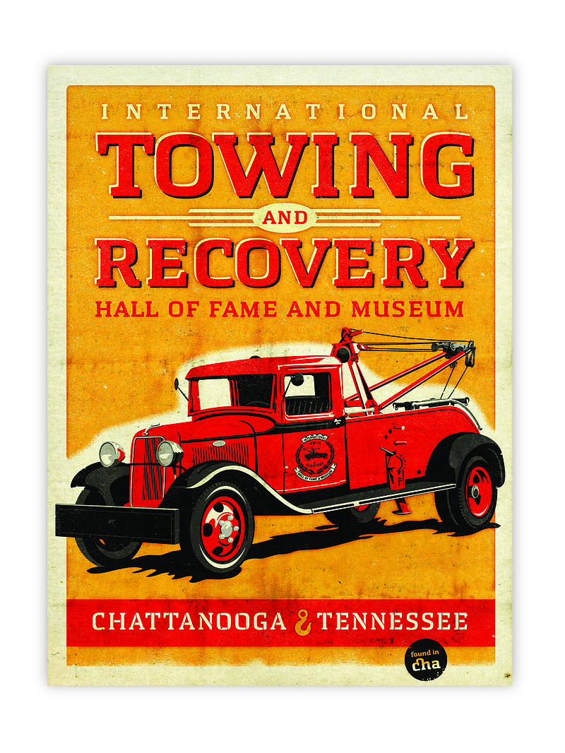
 This poster by Steve Hamaker was designed using Chatype. Local designers are creating Chatype-emblazoned t-shirts and paper products for the typeface's Kickstarter donors.
Chattanooga is almost ready to start giving autographs.
Traces of the city's homegrown and home-owned typeface - Chatype - soon will be showing up miles around - from across the front of The Public Library in downtown Chattanooga to tourism billboards dotting Huntsville, Ala.
The custom-designed alphabet also will creep into the city's redesigned website, Chattanooga.gov, and it may show up in the literature of the Chattanooga History Museum.
The interest and investment in the Chattanooga-specific font has garnered international attention and support since a group of local designers undertook the project last year and rolled out a prototype in January.
"It's moving all over the place," said Jonathan Mansfield, writer and account manager of D+J branding firm, which galvanized the grassroots-funded project.
Besides popping up on design blogs all over the world, Chatype has been spotlighted by both Time and Good magazines' websites. It soon will appear in National Geographic Traveler and London-based global affairs magazine Monocle.
But seeing the typeface show up in blogs will pale in comparison to watching it actually spell out familiar places in the city through signs and literature, the designers say.
Chatype was sculpted by local type designers Robbie de Villiers and Jeremy Dooley, who sought to capture the city's essence in the very shape and slope of the letters. They drew on everything from Chattanooga's manufacturing history to its Cherokee roots to the Walnut Street Bridge.
"It has a lot of fun quirks to it. It's not just a standard typeface," said D.J. Trischler, graphic designer and brand consultant with D+J. "It has an industrial feel to it. There is a uniqueness in the ligatures, like the way this curve connects a C and an H."
Chattanooga agencies have picked up on the uniqueness and are using it to their advantage.
"We're just at the tip of the iceberg here," said Dave Santucci, vice president of marketing for the Chattanooga Visitors Bureau, which is commissioning the billboards in Huntsville. "We run a lot of ads in Chattanooga to drive tourism, and we're certainly anticipating using this font more and more in those."
Corinne Hill, new director for The Public Library, said she became excited about incorporating the typeface before she even moved here from Dallas a few months ago.
"I was still in Dallas and I was in a meeting with some architects talking about just how important fonts are in brand design," she said. "Right after that meeting [Chattanooga library board chairman] Jim Kennedy sends me a link about this new font. At that moment I was just like, 'We have to do this. We will absolutely use this.'"
She wants the font used in everything from reference signs in the library to the bookmarks it gives away.
Maycreate Idea Group, the design firm that has handled the library's rebranding, is also redesigning the city's website and has used Chatype on the newly relaunched Web page - chattanooga.gov. And they plan to use it more, said Brian May, senior creative director and founder at Maycreate.
"Anything related to branding the city in the future, we want to use Chatype," said May. "It makes me proud to show off the typeface when we talk to clients and our network of freelancers. It gives us bragging rights."
May said he and other designers in Chattanooga have been dreaming about having a city typeface for more than a decade, but the stars didn't really align to make it happen until now.
The Chatype group said the project was carried on the momentum of an entrepreneurial, renaissance spirit that they see as one of Chattanooga's hallmarks.
"It's really interesting that, in an entrepreneurial town, a group of creatives would time the market correctly and have the talent in line, and have the support and the funding taken care of, and then to pull the trigger at the right time to make it happen, to take advantage of all these elements to launch something," Mansfield said.
He and Trischler helped match-make Dooley and de Villiers with a group of designers and branding gurus during the local entrepreneurial event 48-Hour Launch last fall. It was there they first blueprinted the font.
In January, the Chatype group used fundraising website Kickstarter.com to help raise $10,000 to further the creation process. By March, the group had exceeded that goal by $1,400 with donations from more than 300 people.
Right now, the typeface and the webfonts are still a rough draft. Local designers are testing it out, crafting posters, postcards and T-shirts to give to donors. In the process, Chatype has undergone significant polishing from its original form.
"It looks like a suit that was wrinkled and now all the wrinkles have been ironed out," described Trischler. "It looks much more professional."
The group hopes the font will be ready for public downloads by June. Though the typeface will be free, the group is careful to lay out its intentions for the font: That it be used for agencies and projects that are distinctly and exclusively Chattanooga-driven.
It's not really intended for private businesses, personal brands or political campaigns, Trischler said. Chatype - in the very shape of its letters - is meant to reference Chattanooga.
That referential aspect is something Santucci wants the agency to leverage.
"We want to use the font, but we also like to capitalize on the concept that we have our own font. We're toying with the idea that, in some ads, we will include asterisks that say, 'The only city in America with its own font.'"