It sounds like the oxymoron of design challenges: Update a kitchen with all the modern conveniences, but don't lose the charm of a circa-1920s bungalow.
That's the challenge Haskell Matheny faced when Ahmed Alshabibi and Greg Turner asked him to renovate the small, dated kitchen of their home in Cleveland, Tenn. Alshabibi, a Cleveland caterer, and Turner, a Unum employee, were drawn to the 90-year-old home five years ago by its convenient downtown location as well as the allure of living in the town's historic district.
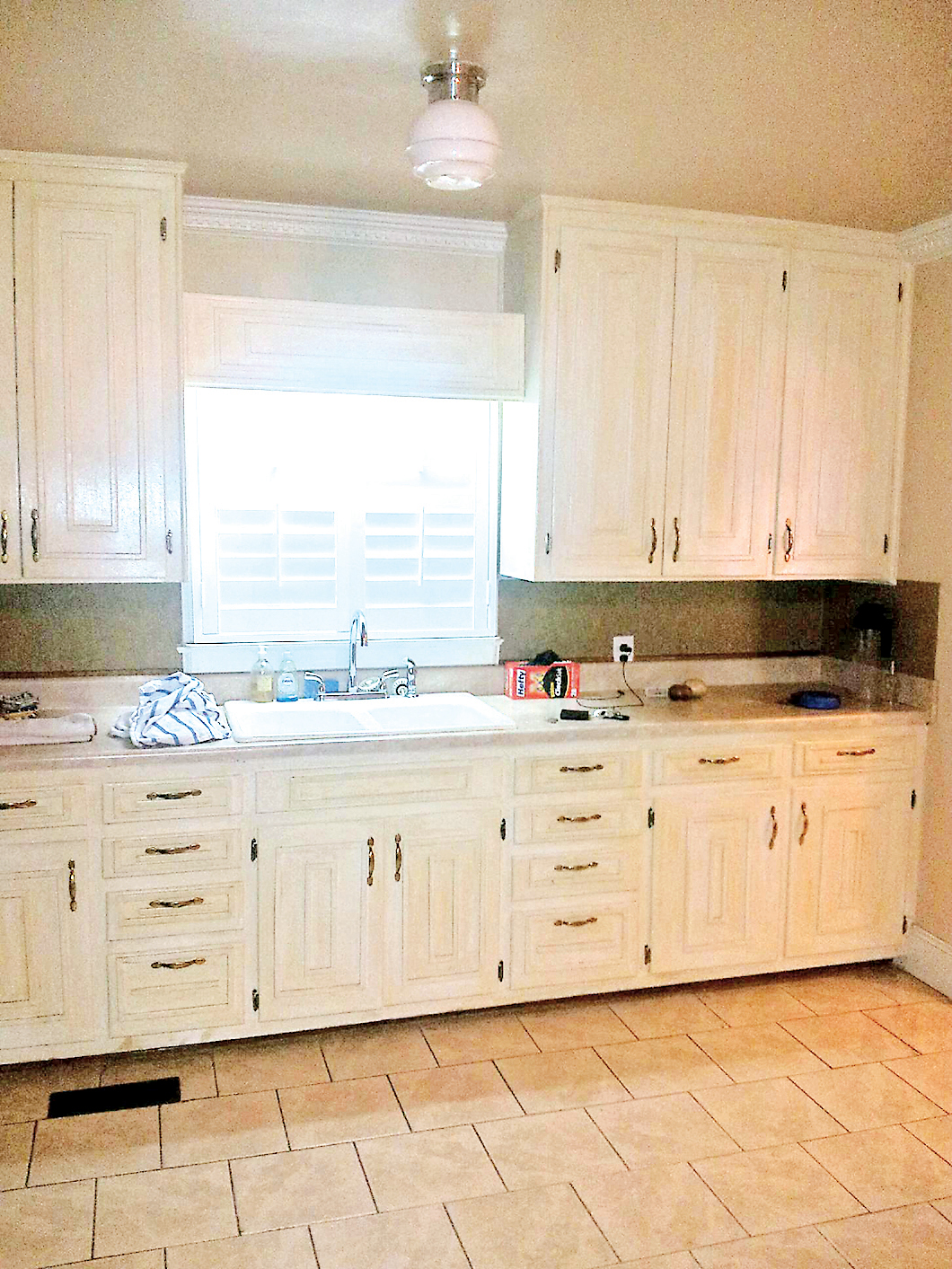 This "before" shot shows the former tile floor, faux-finish on the cabinets and lack of lighting. Check the floor vent in front of the sink — a nuisance when prepping food because anything that dropped on the floor risked falling down the vent.
"This room was originally two separate rooms: a bedroom and galley-style kitchen," Alshabibi says. "The owner before us took the bedroom out and was using that space as a small dining/sitting room for the kitchen. I wouldn't even have called this a kitchen; it was a wall of cabinets with some appliances thrown in."
Even now, the renovated kitchen is just 12 feet wide by 19 feet long after the removal of the dividing wall. But the space issue intrigued Matheny.
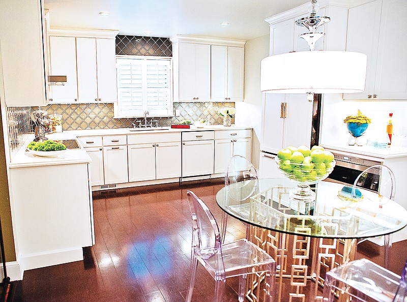
"Too often, people think that, for a room to make a dramatic impact, you need a big space with big windows," says the designer. "This is a great-looking kitchen in a small space. It's about high-style items put in a traditional kitchen with a twist."
His redesign was interesting enough to catch the attention of editors at Signature Kitchens and Bath magazine. The kitchen is featured in the winter issue now in bookstores.
The former kitchen was dated by its yellow faux-finish cabinets, mismatched appliances and a poor floor plan that had the stove and refrigerator each free-standing on a wall away from the food-prep area. Alshabibi said a heating vent had been cut into the floor tile right in front of the counter -- a nuisance for anyone at the workspace because spills or chopped items were likely to tumble into the vent.
In his redesign, Matheny says he looked for "transitional" elements, items that were on trend, yet would complement the home's 1920s roots.
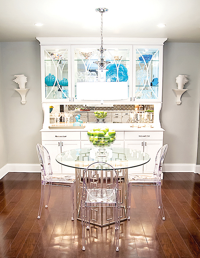 Glass doors and shelving combined with a mirrored backsplash on the custom-made maple china hutch adds to the illusion of greater space in the room.
"You can't just divorce the kitchen from the rest of the house," he explains.
A dark, 5-inch-wide, walnut plank floor was laid, which gave the room an aged, established foundation. The glass tile chosen for the backsplash wasn't the typical horizontal brick, but a solid charcoal glass imprinted with a repeating Moroccan, arabesque-like swirl -- modern style but with a traditional look.
Yellow cabinets were replaced with white maple ones, whose recessed-fronts are so tailored that Matheny describes them as almost Shaker-like. But their doors were updated with square polished-nickel hardware.
The redesign also incorporated elements to give the illusion of greater space.
Instead of limiting the glass tile to an 18-inch backsplash behind the sink and counters, Matheny ran it up the walls around the window and range hood to add height to the room. A mirrored backsplash was incorporated in a custom-made china hutch to reflect light.
Although the dining table is located in the center of the kitchen, the choice of a glass-top pedestal table allowed visitors to see the floor beneath so the table doesn't stop the flow of the room.
"In homes of the 1920s and '30s, there were no islands like we see in kitchens now. They had eat-in tables where the family prepared their food and ate together," says Matheny. "And they would store their dishes in a hutch."
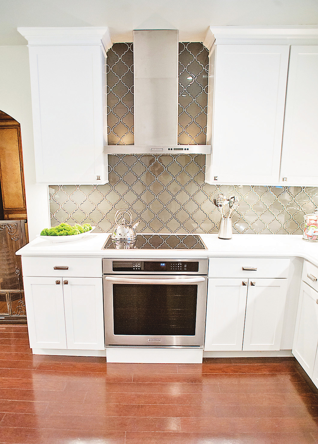 The glass tile chosen for the backsplash is a solid charcoal glass imprinted with a repeating Moroccan, arabesque-like swirl — modern style but with a traditional look.
Turner's one desire for the renovation was the inclusion of a coffee bar, which was accommodated by enclosing the doorway to a small storage area beneath the hall stairs, creating a new side wall in the kitchen. The bar's shelving was recessed into the wall, making the coffee machine easily accessible from the dining table, but unobtrusive and not using any counter space.
But what Alshabibi enjoys most is his increased workspace.
"Previously I had about 8 feet of counterspace underneath the window. Now I have double, if not triple, that space," says the caterer.
"Another thing I love is having a microwave drawer instead of the microwave over the cooktop," he says.
In the setup, the microwave is fitted into a base cabinet, its door flush with the front of the cabinet. Press a button, the door opens and the microwave tray slides out.
Matheny says not only is a microwave drawer a space saver, but a safety factor. "There is less danger when the cook doesn't have to reach over boiling, steamy pots on the stove to lift dishes into or out of the microwave," he describes.
Contact Susan Pierce at spierce@timesfreepress.com or 423-757-6284.