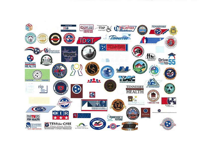
NASHVILLE - Despite the unplanned and rocky rollout of Tennessee government's new logo, Gov. Bill Haslam is sticking by his brand, saying standardization is needed in a confusing situation where dozens of state agencies have their own emblems.
But Haslam also said he didn't think the ensuing tsunami of mostly negative news coverage was overblown after a conservative blogger outed the new TN logo last month before an official rollout.
Nor does the the Republican governor believe his administration mishandled the flap after a Nashville television station picked up on the logo story, prompting a Twitter feeding frenzy of criticism.
"I get it," Haslam said. "That's something people can understand and say, 'Why did you spend $46,000 for something I could have done at home?'"
But he thinks people are missing the context: "The state is one enterprise. We're Tennessee government."
"In state government we have 172 different logos right now, OK? Every different department, every agency. And they're all different and they all change on a somewhat frequent basis, which costs the state a lot of money."
Haslam acknowledged some commissioners are less than thrilled with the new logo, which places the letters "TN" in white against a red background with a blue border on the bottom. It resembles Tennessee's flag but doesn't have the blue circle with the three white stars symbolizing the state's three grand divisions.
Critics, including some state lawmakers, were incensed at the loss of the beloved "Tri-Stars," but Haslam said the image is in the public domain and the state couldn't get a trademark.
He emphasized the logo won't supersede the state flag or the official seal, with its 19th century symbols of commerce and agriculture such as a flatboat and plow.
Transportation Commissioner John Schroer, a Haslam appointee, is said by some employees to be unhappy over the change. Asked if that were true, Schroer said, "It's a plan the governor wants to do, and as an employee of the governor, we're going to what they ask us to do."
Soon after Schroer took office in 2011, he replaced the environmentally themed logo introduced by former Democratic Gov. Phil Bredesen to one featuring the TDOT acronym.
"My people work for TDOT and they love the [current] logo and they love wearing hats and jackets [featuring it]," he said. "There's some emotional ties but it'll all pass and at the end of the day I think the governor had a pretty good idea about consistency."
As Haslam and top staffers are now learning, logos, symbols, emblems and brands can be powerful things. Back in the 1980s, the Tennessee Valley Authority underwent withering criticism after it paid $28,000 to a New York City firm for a new symbol for the federal utility, featuring a slimmed-down version of its TVA acronym.
Haslam used a Nashville firm.
In the mid-1990s, a controversy erupted after Republican Gov. Don Sundquist unveiled his new license plate design. The governor borrowed the "sun" design, a play on "Sundquist," that he deployed on his 1994 campaign signs.
Children's Services Commissioner Jim Henry isn't among the carping critics. He can't wait to get rid of his department's current brand, but said the "big thing" to come is to update the department's website.
"That's going to be a huge help to people. More friendly. The logo part, as you know, is only part of the entire rollout," Henry said.
Still, danger potentially awaits Haslam and his logo in the General Assembly.
"There's not going to be a change," declared Sen. Frank Niceley, R-Strawberry Plains, who hates the new logo. "The Legislature hasn't told the governor yet, but there's not going to be a change."
Contact Andy Sher at asher@timesfreepress.com or 615-255-0550.
