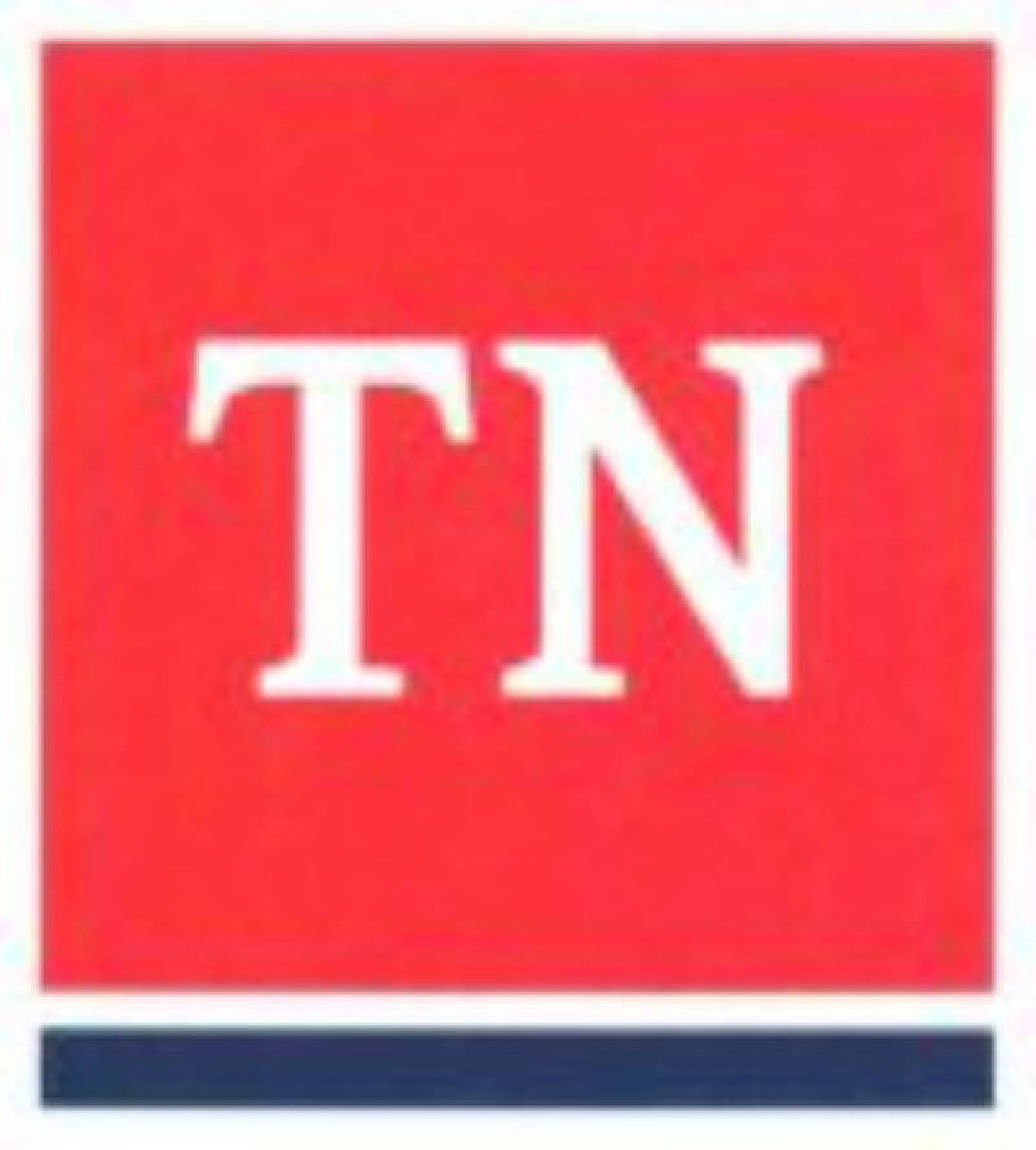
The sad tale of the $46,000 new Tennessee logo gets better and better.
The "simple" but pricy logo that looks like the postal designation for our state, TN, is exactly that: Too simple and maybe too much like the postal designation for the state.
After Gov. Bill Haslam took lots of guff and a "Pork of the Year" wasteful government spending award for our postal designation, er- logo, the U.S. Patent and Trademark Office last week rejected the state's application to register it on the basis that it is "primary geographically descriptive."
That means the main significance of the logo is geographic and can't be trademarked.
"It's to prevent someone from claiming exclusive rights to use a term that other people need to use to communicate that their product comes from Tennessee," Wayne Beavers, shareholder with Nashville-based Patterson Intellectual Property Law, told a reporter with the Tennessean.
Well, yeah. But, come on guys, it's a $46,000 "primary geographically descriptive." It just looks a lot like a postal designation.
After all, it took nine months to create. It was tough. A typed TN in white on a red square with a blue line under it.
Mocking aside, Haslam rightly has defended the primary idea of creating a new state logo that would be used by all state departments which now have myriad different logos - some 172, according to the governor. When they need to be tweaked, which Haslam said is more often than one would think, they collectively are more expensive to maintain than the $46,000 single logo intended to go on all state papers and websites.
In Chattanooga recently, Haslam said the main reason for creating a new state logo that could be patented and easily maintained for years to come was that Tennessee already had learned it could not trademark its flag or the tri-star circle in that flag. Nor would the feds allow the patenting of the state seal.
Seemingly, this would indicate that state officials would know what else the feds wouldn't allow trademark patents for - like postal designation look-alikes.
Even if state workers and contractors couldn't read federal trademark guidelines, did it just never occur to someone to show a draft design to representatives of the patent and trademark office? Maybe before the price tag reached nearly 50 grand?
GS&F, a Nashville firm reportedly won the low bid and designed the logo, but perhaps a few clicks around the gsandf.com website would have been instructional. A browser description says "Here at GS&F we are a Fully-Integrated Nashville Advertising Agency and we expose the truth, create an experience around it, and make consumers want to act."
The group did not return reporters phone calls last week. On Friday, a receptionist referred our questions to the state.
A Nashville-based blog called "The Root," which reports on trademark issues, reported the federal rejection on June 14.
A Thursday story on Watchdog.org, an online publication of Tennessee Watchdog, reported that state officials said the week before that they had postponed officials use of the new logo due to technical glitches on state websites.
Imagine that. Problems on Tennessee's new website.
As for the logo rejection, the state has six months to appeal, and Haslam spokesman David Smith said the administration is reviewing the decision.
"As I understand it, it's typical of this process for there to be some back and forth," Smith said.
That's how Tennesseans feel. We're being swung back and forth - in the breeze.

