
Sunday, November 15, 2026Nov 15

Organizers go for harmony in new Tokyo 2020 logo

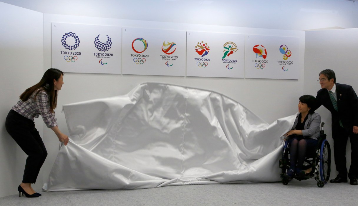
FILE - In this Friday, April 8, 2016 file photo, Tokyo 2020 Emblems Selection Committee Chairperson Ryohei Miyata, right, with its members, Ai Sugiyama, left, and Aki Taguchi, unveil four designs shortlisted to become the official logo of the 2020 Tokyo Olympics during a press conference in Tokyo. Organizers unveiled the new official logo of the 2020 Tokyo Olympics on Monday, April 25, opting for blue and white simplicity over more colorful designs. The winning logo, shown far left, selected from four finalists, is entitled Harmonized Checkered Emblem. It features three varieties of indigo blue rectangular shapes to represent different countries, cultures and ways of thinking. (AP Photo/Shizuo Kambayashi, File)

TOKYO (AP) – Organizers unveiled the new official logo of the 2020 Tokyo Olympics on Monday, opting for blue and white simplicity over more colorful designs.

The winning logo, by Japanese designer Asao Tokoro, is entitled Harmonized Checkered Emblem. It features three varieties of indigo blue rectangular shapes to represent different countries, cultures and ways of thinking.

“My mind has gone blank as I just found out my design won,” Tokoro said. “I put a lot of time and effort into this design as though it was my own child.”

The initial logo by Japanese designer Kenjiro Sano was scrapped last year over allegations of plagiarism because of its similarity to the logo of a theater in Belgium.

A special selection committee was subsequently established to choose the new logo. The committee selected the winning design from four finalists that were shortlisted from 14,599 entries submitted in a contest open to the public.