
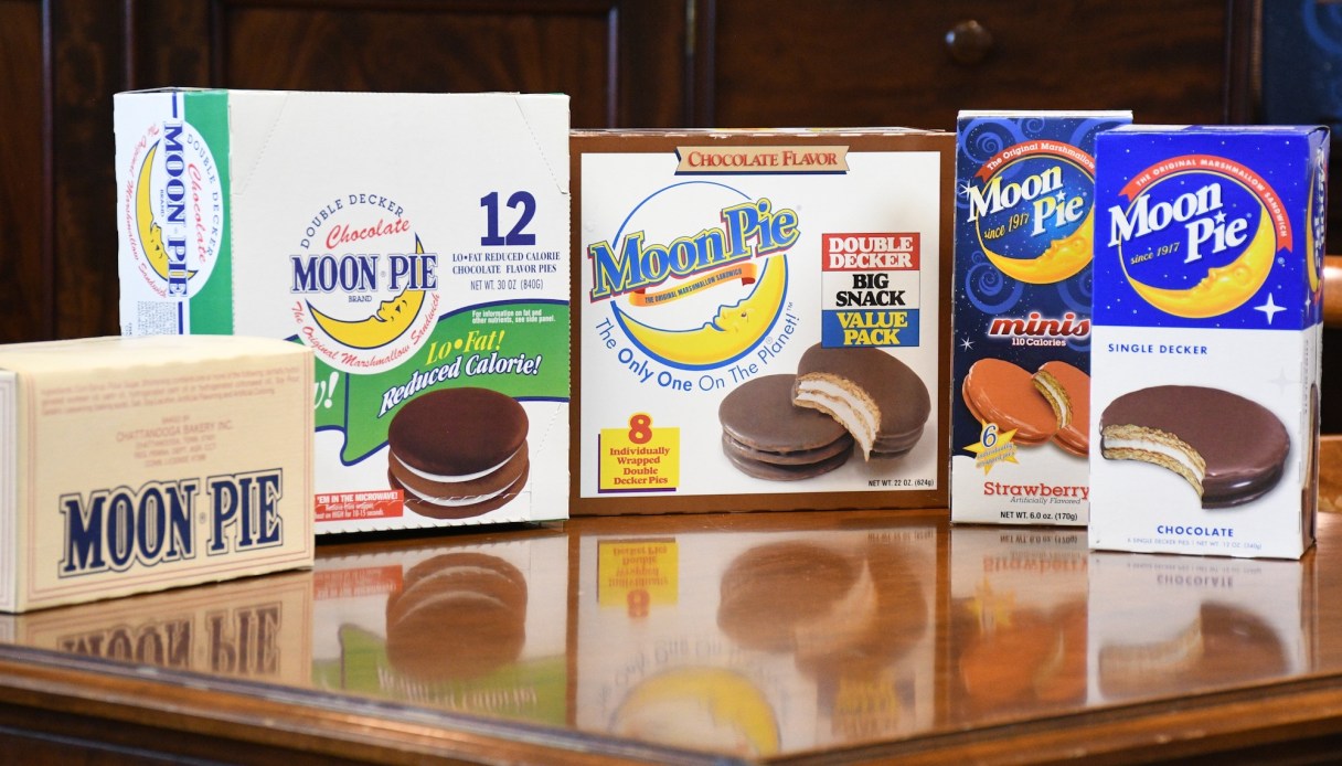

There are certain things that won’t change about the MoonPie logo no matter what: the man-in-the-moon, the block letters and the Americana color palette.
These aspects have “remained sacred” since Chattanooga Bakery started making the MoonPie in 1917, says Tory Johnston, the company’s vice president of sales and marketing.
Through highs and lows — perhaps none lower than the “Lo-Fat MoonPie” which lasted for one year in the late 1990s — the brand has stayed true to its roots while keeping up with the culture.
“Consumers eat with their eyes,” Johnston says. “Brands need to always convey a forward motion and energy.”
The fifth-generation family-owned bakery has changed its main logo five times. It swapped out its “The Original Marshmallow Sandwich” slogan for “The Only One on the Planet!” before switching back.