

A new logo can signal change, but it can’t create it.
“You can’t just say, ‘Hey, we’re going to redo the logo,’ and expect everything to change,” says Chattanooga designer Chris Enter, owner of Chris Enter Design. “It has to be [seen] throughout the company, and then has to be throughout every piece of communication you put out. You can’t halfway do it.”
Successful rebrands take time, investment and vision, he says. “And a lot of that has to come from the top — from the CEO or leadership team. They have to be on board. If it’s not there internally as a company, there’s no way that it can execute properly.”
So, what exactly is a brand, anyway? At its core, says Enter, it’s about company values and its promise. Or, in the words of Amazon CEO Jeff Bezos — it’s what people say about your company when you’re not in the room.
Too often, companies make the mistake of looking to rebranding as a way to generate publicity.
“I have been involved in situations where a company just wants to do it to get some traction — maybe they’ve been out of the news and want to get back in,” he says. “There’s nothing really different. They just want more marketing, more promotion. That’s the negative side of it, and I would never recommend anybody ever doing that.”

The most effective rebrands are about real, internal change — shifts in ownership, vision or values. As a local example, he points to Niedlov’s Bakery, a company that started out small. After a change in ownership, the company has evolved into becoming a beloved local brand throughout the Chattanooga region and into Alabama and Georgia.
“They’ve expanded, they’ve started offering their products in grocery stores and restaurants, and they’ve really done a good job. That new vision came from the new ownership, and that’s a great example of a reason to rebrand.”
That alignment between values and action — what Enter calls “walking the walk” — is what builds customers’ trust. “If someone acts one way in public and another way somewhere else, you don’t really trust who they are. You have to stick to who you are. That’s what makes a brand make sense.”
White Star Dry Cleaners
For Rob Whitmire, the decision to rebrand White Star Dry Cleaners — unifying all its locations under one name — was more than a marketing move. It was personal.
“I chose to rebrand primarily to honor my mother, Joann Whitmire, who passed away from Alzheimer’s in 2014,” he says. “My sisters, Sherry and Kim, and myself grew up in the business — and by growing up, I mean sleeping in laundry carts as babies while Mom worked.”
From the 1960s onward, the Whitmire family’s White Star Laundry and Cleaners was a fixture in the East Lake neighborhood of Chattanooga. But after the family sold the linen supply side of the business in the late 1980s, the name went with it.

Over time, the company grew to five locations operating under three different brands and three companies, which became confusing for both employees and customers. When Whitmire and his wife, Lois, purchased the business in 2010, they decided to bring everything back under the original White Star name.
“Right away I was overwhelmed with at least a hundred emails and phone calls from past customers, former ball players [who had been sponsored by White Star while playing sports growing up] and family friends telling me it was a great idea,” Whitmire says.
“I would advise anyone thinking about rebranding to do their homework and get opinions from everyone they possibly can. … What seems like a good idea may just be an emotional decision. Get your staff educated on the reason for the rebrand and to buy into the brand.”
But this wasn’t Whitmire’s first rebranding rodeo. He had seen the company through the process twice before and had an idea of what to expect.
“You have to ensure the customers know it is the same ownership. You have to let the customer base know why you are doing it, and you have to do that for a long time,” he says. “In our case, I repeated advertising through the newspaper and emails explaining the rebrand. And I did not make any other changes, like price changes or changes to procedures during that time.”
Rock City Gardens
After sharing a logo with its parent company for 25 years, Rock City Gardens decided it was time to step out on its own.
“A big part of this rebrand was to differentiate between the two businesses. … This was also a way to signify a new chapter for Rock City, especially following new ownership in 2022 [when CEO Doug Chapin became the fourth-generation leader.],” says Pepper Raper, public relations manager at Rock City.
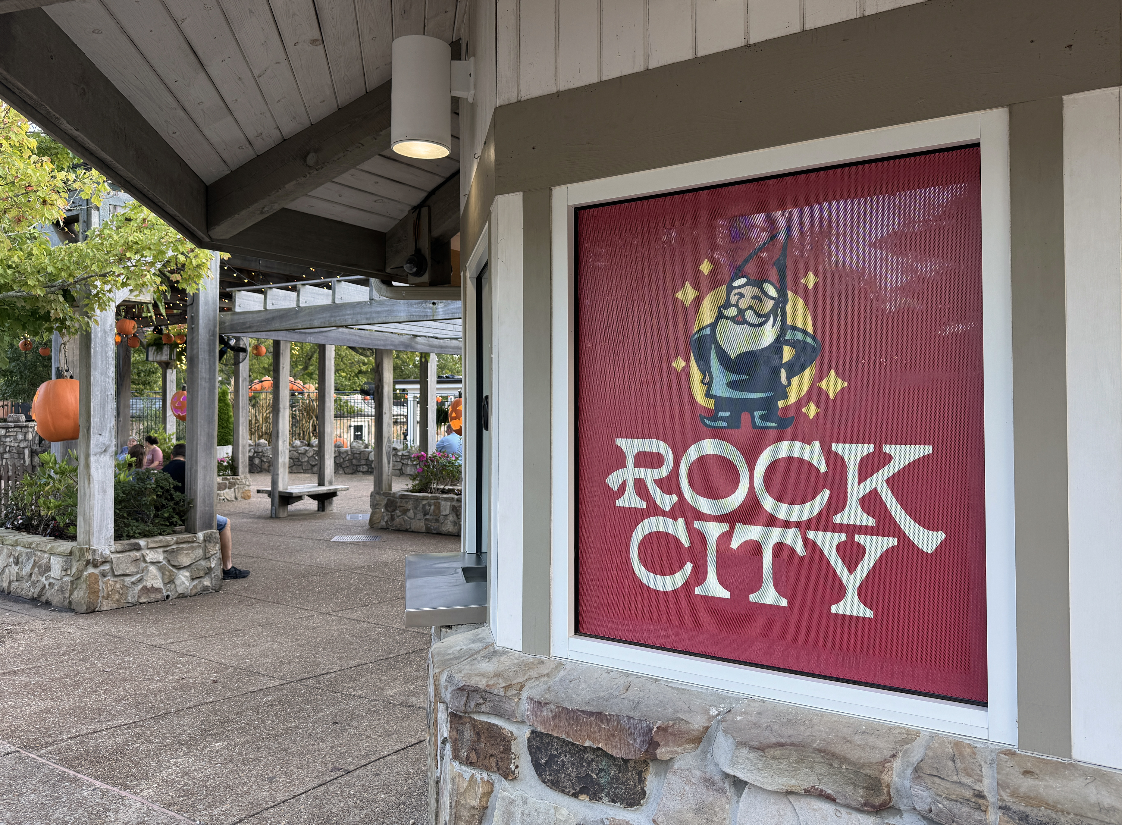
During the 1950s, artist Clark Byers created what became Rock City’s most iconic branding: the now-famous hand-painted barns along highways inviting travelers to “See Rock City.” Later, from 1977 until the late 1990s, a rainbow logo served as the company’s seal. And in 1998, Rock City introduced the familiar “bottle top” logo, its jagged edge a repetition of the silhouette of Lookout Mountain.
That’s the logo modern-day visitors have known until this summer, when the gardens unveiled their new look with fresh typography, a brighter color palette, and a decision to bring their oldest, most magical residents — the gnomes — into the spotlight. As a part of that effort, each trail now features a gnome “caretaker,” complete with a name and backstory, adding to the gardens’ lore.
“The gnomes have always been a part of Rock City’s history, even since we opened in the 1930s,” says Raper. “They’re something nobody else has. No one else has gnomes, so we decided to lean into that.”
At the same time, the team worked to ensure the new branding stayed true to Rock City’s connection to history and hospitality.
“Rock City has always been rooted in the wonder of nature and community, and we wanted that to come through in how people experience us, from the first logo they see to the last trail they walk,” Raper says.
“We love that people feel so strongly about Rock City. But I think what’s important is that this rebrand didn’t change what makes Rock City so special. It’s just showing it in a brighter, more updated way.”
City of Chattanooga
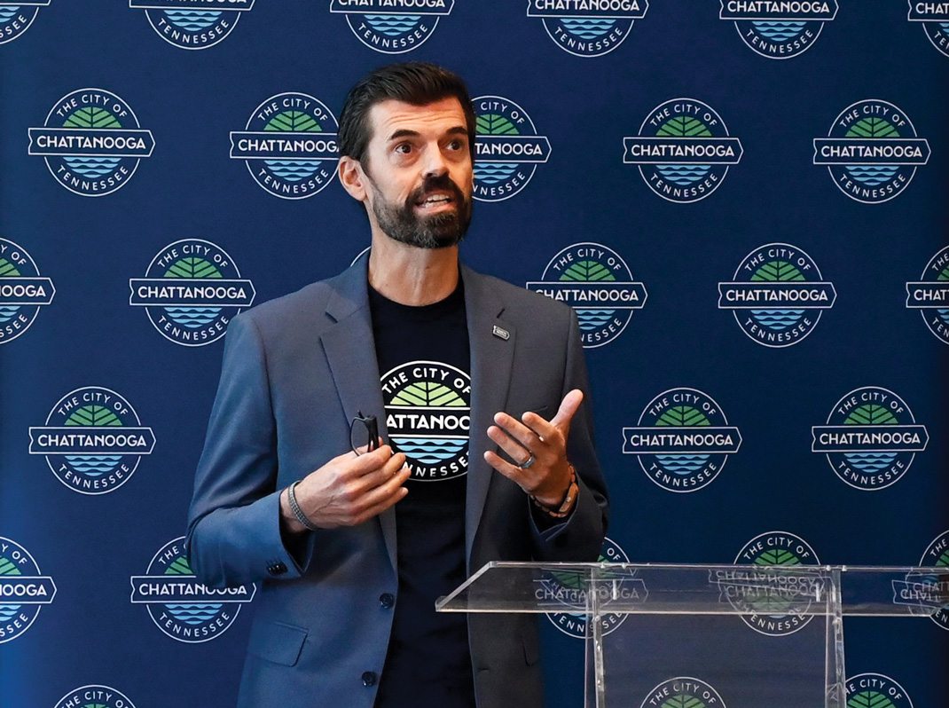
Last summer, the City of Chattanooga launched its first-ever brand identity.
But while it was technically a first, the process functioned much like a rebrand. The new logo and marketing materials were created to help distinguish between city and county services and to serve as a symbol of modern progress and values.
A video on the city’s website acknowledges Chattanooga’s “complex history.” The city sits on land once belonging to the Cherokee Nation, Ross’s Landing marks the start of the Trail of Tears, and the area was the site of several major Civil War battles. Later, industrialization brought economic growth but along with it pollution.
In recent years, the city has become known for offering residents some of the fastest internet service in the nation and for being named a National Park City — a title earned for efforts to blend urban life with nature.
In a release, Chattanooga Mayor Tim Kelly says the new branding honors that history, recognizes modern progress and looks ahead to a bright future. The new logo draws from local imagery — mountains and forests, local waterways and Chattanooga’s railroad heritage — and lettering was chosen to echo vintage signage from the city’s industrial heyday.
Steve Hamaker, the city’s director of design, says in an email that the rebrand will be successful when residents can easily recognize what services come from city government.
“By using the city seal, we were creating a lot of confusion with Hamilton County, which uses an almost identical seal,” Hamaker says. “And it didn’t help that different city departments had different colors and fonts. The rebrand gives residents an easy shorthand to know, ‘This is a city service.’
“We hope it helps people engage more with local government, take advantage of what their tax dollars fund, and give us better feedback on our work.”