
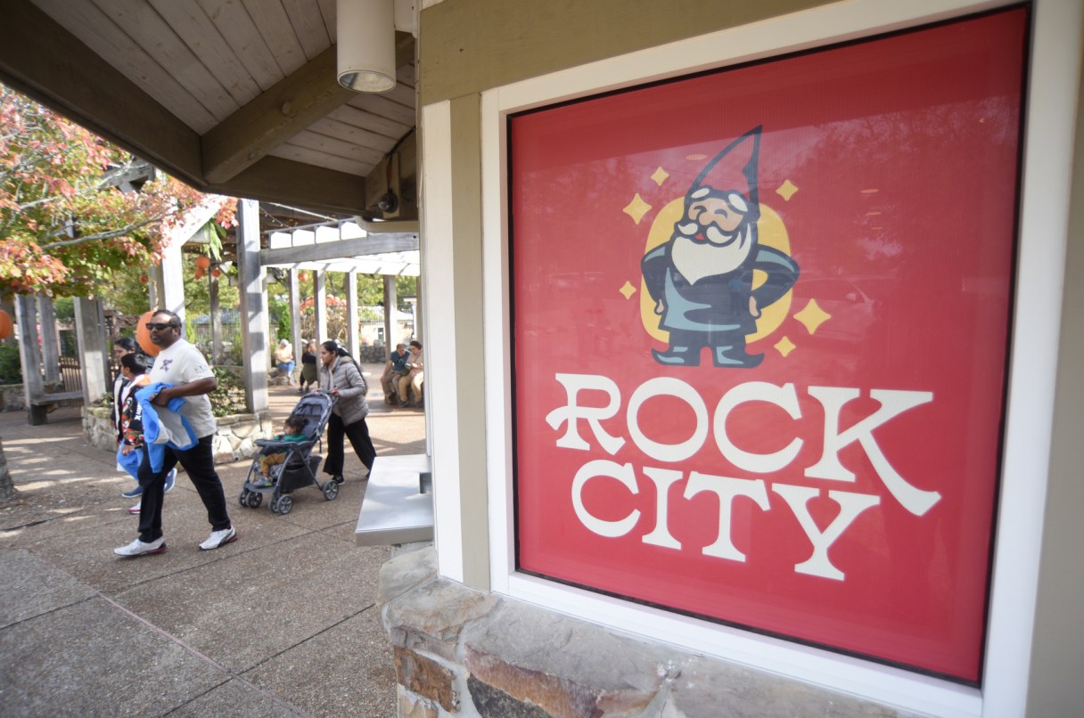

After Rock City launched a new logo in August featuring a jolly gnome, the parent company of the 93-year-old Lookout Mountain attraction learned how many people didn’t know the old logo.
Many people thought Rock City Enterprises had somehow gotten rid of the famous “See Rock City” birdhouse, based on an advertising campaign by artist Clark Byers to paint the slogan on more than 900 barns across the Eastern U.S. from 1935 to 1965.
“The birdhouse has never been our logo, ever,” Doug Chapin, president and CEO of Rock City Enterprises, said in an interview. “This highlighted that we needed to rebrand, because you don’t know what the logo is, and it’s not working well.”
The parent company launched its own rebrand two months before it introduced a gnome mascot for its centerpiece Georgia property, formally called Rock City Gardens.
Rock City Enterprises changed its name, which had been See Rock City, and adopted the birdhouse as its corporate logo in June. The Chattanooga-based company owns Clumpies ice cream and several hospitality ventures.